You are using an out of date browser. It may not display this or other websites correctly.
You should upgrade or use an alternative browser.
You should upgrade or use an alternative browser.
The Augustana | 96m | 30s | Pangman | DIALOG
- Thread starter SRC Admin
- Start date
Kaizen
Senior Member
Kaizen
Senior Member
dunno
Active Member
does anybody else find this one incredibly generic? like it’s better than peregrine pointe or other terribly 00s stucco condos insofar as it doesn’t harshly offend, but it definitely doesn’t add anything interesting to the skyline beyond some height / bulk and it is very bland.
Last edited:
Romanov
Active Member
Edmonton's skyline already has way too much beige
_Citizen_Dane_
Active Member
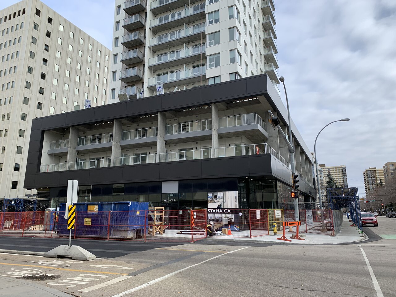
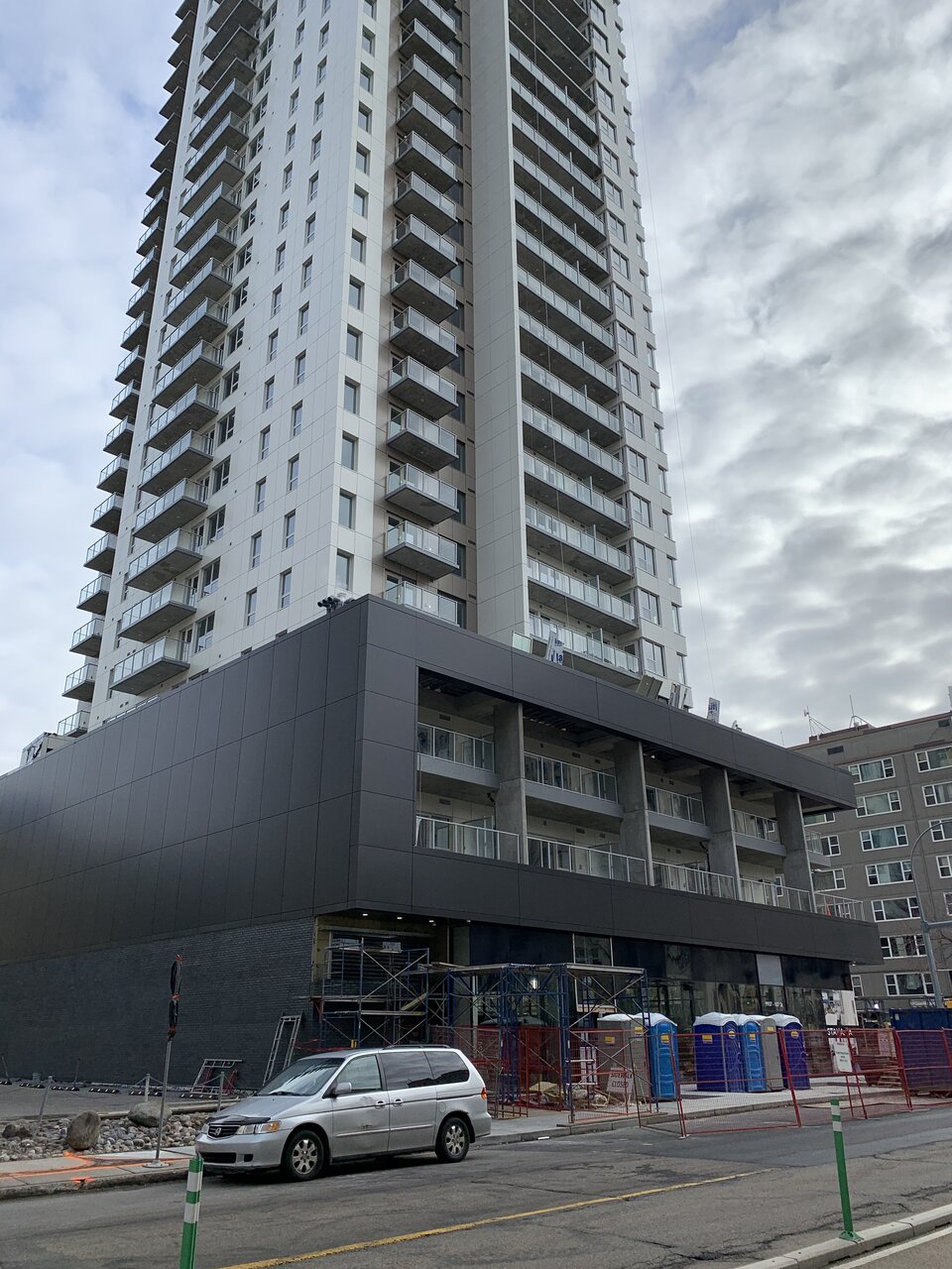
Some quick shots from today. I never realized it before, but the podium's set back quite a bit from the City's sidewalk on the southside and really helps it not feel too overbearing. The whole thing's shaping up nicely, but like some others I can't say I love the cladding colour. I don't know, given that the rest of the area features so much precast, I think something different would've helped it stand out more. I do like the dark grey brick at street level though.


_urbanite
Senior Member
Some quick shots from today. I never realized it before, but the podium's set back quite a bit from the City's sidewalk on the southside and really helps it not feel too overbearing. The whole thing's shaping up nicely, but like some others I can't say I love the cladding colour. I don't know, given that the rest of the area features so much precast, I think something different would've helped it stand out more. I do like the dark grey brick at street level though.
View attachment 275194View attachment 275195View attachment 275196
If they had mixed in some beige with the white chunks, and some white with the beige chunks, then I think the cladding would've been more tolerable. If they had used a different color altogether to mix in with the white & beige, then I think it could've turned out to be pretty alright
Last edited:
Member Bio
- Joined
- Sep 22, 2015
- Messages
- 10,217
- Reaction score
- 23,092
- Location
- Edmonton, Alberta, Canada
Yeah the colours are meh, but at least the materials look durable and not cheap. That alone is a step up IMO.
Edmcowboy11
Senior Member
It will be interesting to see what moves in to the CRU's.
Kaizen
Senior Member
IanO
Superstar
I was told that they were looking for a mid/mid-upper level full-service restaurant.
From the looks of it at night, I'd say that 10-15 units are now occupied.
From the looks of it at night, I'd say that 10-15 units are now occupied.
archited
Senior Member
^^^^ I have heard that they are friendly but shy.
Clearshades
Senior Member
Shy or is she just hardly to get?
Avenuer
Senior Member
From today:


Omega Prime
New Member
I really like that podium 


