Member Bio
- Joined
- Sep 22, 2015
- Messages
- 10,217
- Reaction score
- 23,092
- Location
- Edmonton, Alberta, Canada
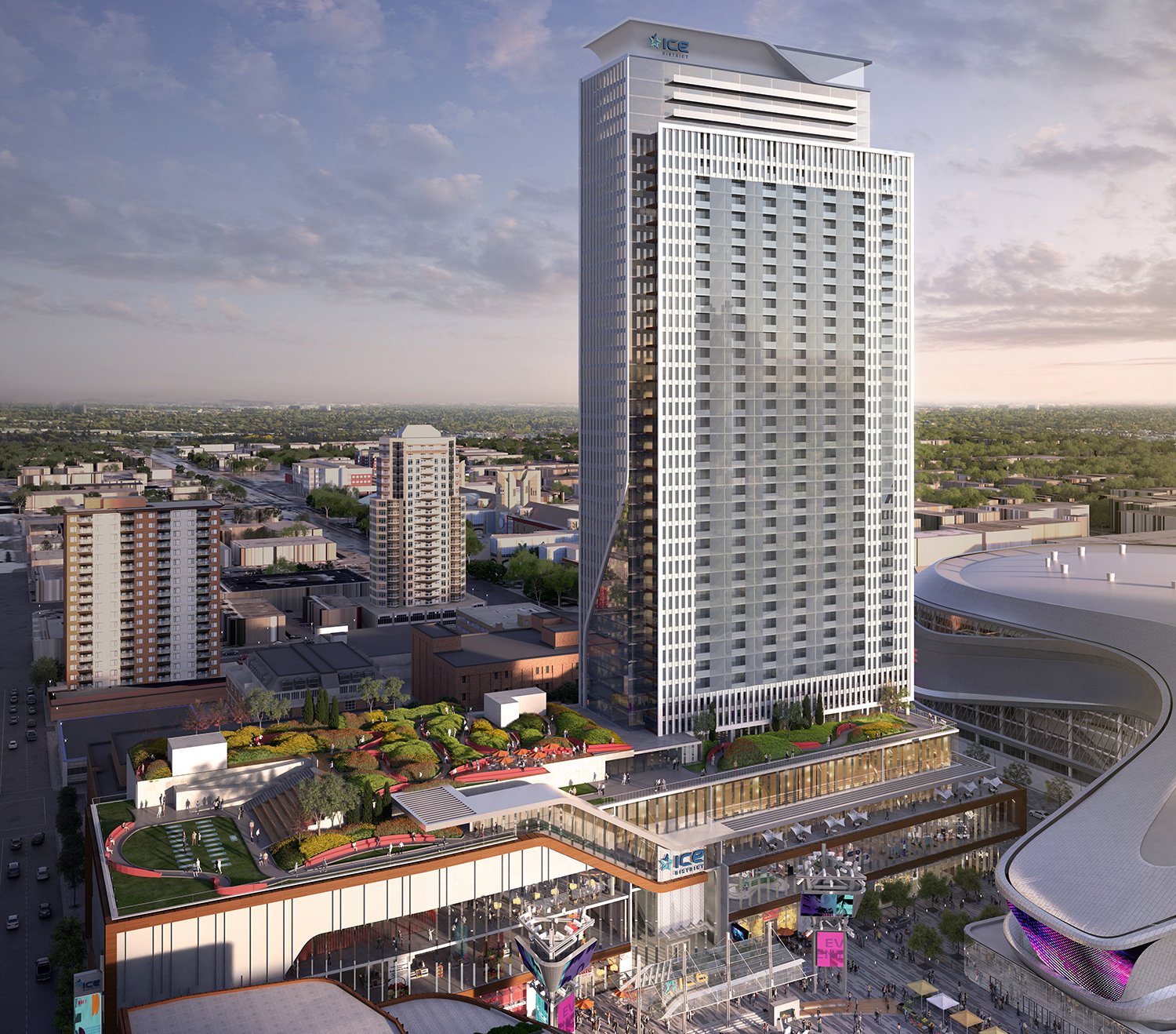
It looks much shorter now
It's still ~149m, or Manulife height. That's not too bad.
@archited I'm still kinda digesting the design, but having looked at it a bit more closely: I like the articulation of the south elevation of the tower. I kinda like the "floating" grid that frames the east wall (a nice throwback to International Modernism). Podium is cool and full of active uses.
Not sure I like the unbrokenness of the east elevation, though, I feel it could have used at least one point of articulation to make it feel less like a giant wall. I'm meh on the crown, it's not bad, but feels unnecessary.
7.5 / 10
