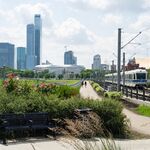


buildings
Active Member
Mercury 1 & 2...mostly all black, Skyrisecities, "YEAHHHHHH so cool! so modern!", This building, mostly all black, Skyrisecities, "BOO!!! what were they thinking?!"
|
|
|
Mercury 1 & 2...mostly all black, Skyrisecities, "YEAHHHHHH so cool! so modern!", This building, mostly all black, Skyrisecities, "BOO!!! what were they thinking?!"

It is more a design issue. Unless the only thing in their budget is paint, there are some smaller not expensive things that could be done to improve this.Pretty sure what you see here is the maximum allowance in the developer's budget before a complete tear-down to surface parking conversion was a more viable option.

It took about 3 days after the last snow fall for the roads downtown to be cleaned. I have no idea why that is acceptable.Do they pay taxes? Look at those roads!