News   Apr 03, 2020
 8.3K     3 
News   Apr 02, 2020
 9.7K     0 
News   Apr 02, 2020
 3.1K     0 

Warehouse District Park

^ she also said that in many ways that Edmonton's Winter City Strategy, which came out around 2012, is very good. In fact other presenters at this conference - in the US and Europe - referenced it as a leading document on the subject that impacted their city policies.

But what's in the strategy and what's implemented is not always the same. She said former councillor Ben Henderson was a leader on that file and when he left council in 2021 nobody else has really championed it and that knowledge has been lost.

The Edmonton design committee apparently gave a thumbs down to this park.
Who is actually in charge of these things? Who are they accountable to for performance? Why do we have this culture of compromise and inadequacy?
 

Project update - February 2024​

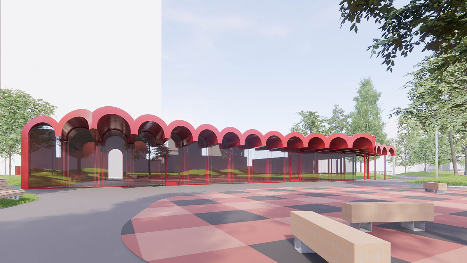
Preliminary design for Warehouse Park is now complete and construction is anticipated to begin in spring 2024.

The design development for the Warehouse Park pavilion has been finalized. This pavilion will include facilities for public restrooms and a multipurpose space serving as a central feature within the park.

WarehousePark-EastViewRendering-1600x1200px.jpg
 
The Warehouse Park was the focus of one of the winter cycling conference sessions today - it was largely panned by the presenter from the U of A urban winter planning specialist who met with different city planning officials in presenting her case.

She said the city was overly focused on safety in this park to the detriment of the design choices and the fear of encampments has led to a lack of imagination and a disregard for Edmonton as a winter city.

She argued the park has no sense of place.
She said one of the biggest misses was not having a place for food and drink which can keep people around for a lot longer per visit to the park no matter what the weather.
She asked the city why not a food vendor and was told that the city didn't want to compete with nearby restaurants. When she shared that, the room laughed.
She described the design choices, particularly the lighting and the picnic blanket design for a couple of the elements as kitschy and a lack of authenticity.
It will lack any life and colour in winter due to tree choices, minimal covered places and general lack of winter friendly elements, she said.
She fears the skating rink will be dropped (from the basketball area) and that fire pits will only come out sparingly during a few specific events.
Being designated as a community park rather than a special and unique city amenity is another mistep, she concluded.
I have been banging this drum for a long while now.
 
🤮

I'd rather them just plant trees and have open fields with no pavilion than that. Also, why must it be pink (or light red I can't really tell from the picture but it looks pink on my screen)? I feel this design, while still not good would look much better in black, white, grey or even blue. Literally any colour but pink would look better.

Overall a garbage design, should be cancelled immediately.
 
I like it too... the red to me looks quite nice and the design is unique. Will continue to pop in the winter which I think is pretty important.

Will be interesting to see how much of that colour on the ground we will be able to see during the winter. I wonder what the snow clearing will be like.
Here's the benches on the modernized section of Jasper Ave at 113 st. I wonder if it will be cleared off. In the past, the answer is no.

20240226_201335.jpg
 
Will be interesting to see how much of that colour on the ground we will be able to see during the winter. I wonder what the snow clearing will be like.
Here's the benches on the modernized section of Jasper Ave at 113 st. I wonder if it will be cleared off. In the past, the answer is no.

View attachment 544006
True, hopefully the pavilion will be visible lol
 
With this design, all I can say is "let it snow!" If this is Cormier's, he should have definitely stuck to Landscape Architecture -- I repeat this deign is terrible and not in a "like it or Hate it" way (e.g. Milner Library) -- "fame" does not justify blatant design miscues.
 
Last edited:
🤮

I'd rather them just plant trees and have open fields with no pavilion than that. Also, why must it be pink (or light red I can't really tell from the picture but it looks pink on my screen)? I feel this design, while still not good would look much better in black, white, grey or even blue. Literally any colour but pink would look better.
I don't necessarily have strong feelings on this design either way, but I notice that your preferred colors appear to be the most neutral/drab/boring options available. I wonder if a pop of color would be more interesting?
 

Back
Top