News   Apr 03, 2020
 7.3K     3 
News   Apr 02, 2020
 7.6K     0 
News   Apr 02, 2020
 2.6K     0 

Warehouse District Park

It reminds me of the level of design that Borden received and is unique, interesting and colourful.

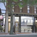
Here are the design images the city was looking at for Kinistaw Park - unfortunately these didn't really come to fruition.These images are from the city report- these I find more interesting and colorful and FUN.
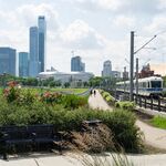
Screenshot_20240227-114748_Drive.jpg

Screenshot_20240227-114555_Drive.jpg

Screenshot_20240227-114706_Drive.jpg
Screenshot_20240227-114647_Drive.jpg
Screenshot_20240227-114624_Drive.jpg


Here is park.
Screenshot_20240227-123045_Samsung Internet.jpg
 
I don't necessarily have strong feelings on this design either way, but I notice that your preferred colors appear to be the most neutral/drab/boring options available. I wonder if a pop of color would be more interesting?
Most likely you are correct. I would say in general, especially for a city like Edmonton which turns monochrome for 5 or more months of the year, adding colour where you can is probably a good thing. My main objection is the particular colour used ie, a dull red/pink, and how it looks on that specific structure. I feel that a more "drab" colour would be better on this particular structure, but not structures in general.

The examples above are examples of a great use of colour, especially red.
Yes, I like the red examples better too.
 
I remember when I used to deal with Ritch Ezra when Arista Records was still a thing and he was VP West Coast A&R, he used to say when reviewing music demos that landed in his office unsolicited that they were often accompanied with a note that said something to the effect that "this demo is better than half the crap that gets airplay on the radio". It was a huge turn-off for him -- they just compared their demo to crap -- what a commendation! Same here -- it diminishes the design result of the building proposal when you compare it to something that is less than. No need to compare it to something else; it is just bad design -- there is no sense of entry, the repetitive hoops are boring and unrelated to the landscape (much less anything to do with the Cityscape around it), and it doesn't define a purpose or a sense of goal -- it is so poor that it could almost be anything else and succeed to a greater degree.
 
Guessing this is more utilities/prelim work, but there’s a skid steer and backhoe moving dirt, plus smaller two excavators that have appeared.

Guessing we’ll know when they’re fully mobilizing when they fence the whole lot.

IMG_5997.jpeg
 

Back
Top