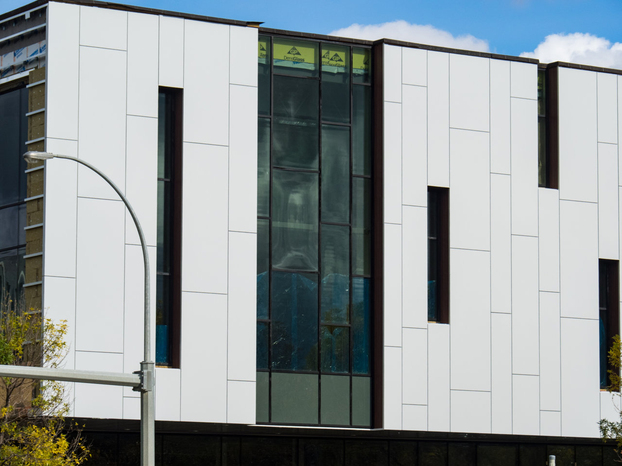
Stanley A. Milner Library | ?m | 6s | EPL | Teeple Architects

What do you think of this project?


  • Total voters
    62
Jeez, sometimes I really feel like I'm the only one in this city that actually is fine with the way that the library looks. Yeah, it could have had a bit of a better design with the parts not facing Churchill Square and all, but I still think that the end product was pretty decent in it's own respect. Also, I REALLY don't like it when people compare this library to Calgary's new Downtown Library. Like, seriously?? This is a renovation of a 50 year old building in the middle of downtown, so they definitely didn't have as much creative liberties as Calgary did.

*Rant Over
 
Also, I REALLY don't like it when people compare this library to Calgary's new Downtown Library. Like, seriously?? This is a renovation of a 50 year old building in the middle of downtown, so they definitely didn't have as much creative liberties as Calgary did.

Now I'll be honest, I really hate the new library design, but I agree on this 110 percent. I seriously don't understand how people can compare the two outside of the fact that they're both libraries. Like you say, one's a refacing of a Brutalist Centennial project while the other's a completely new build — and that's without even mentioning that our's is about 1/3rd the cost.
 
Last edited:
@archited I did say "in this city", didn't I? ;)
 
Finally replacing the warped panels I think?

P9230542.jpg
 
I think that a few things are going to change perceptions re this building -- 1. when the surface interface for the transit station is completed, there will be a better relationship of the library to the street and to transit, 2. when people are able to experience the interior volume of space in the library, there will be more "likes", and 3. the "shelter" aspect of the library on the North face and appropriate street furniture will improve the pedestrian "feel". But to your point, @StopDropandLOL, an additional skin could easily be added to the current finish at any point in time in the future.
 
@cpnfantstk I know that your suggestions are, at a minimum, tongue-in-cheek, but there is something to your design solution -- some strategically placed vertical plant walls would help recast this building in a positive way and, interestingly, the structure is there for support of a large creative planting. The attached photo courtesy of Patrick Leblanc -- a project in Paris, France. In Edmonton we would have to look mostly to evergreen shrubs and all manner of grasses, reeds and sedges.
Patrick Leblanc Project.png
 
That colour is so bad. And those tiny little colourful panels on the roof look like somebody was being super stingy with the sprinkles. Needs more windows, and a better cladding. The overall shape is not too bad, except for the back corners that reveal it to be the makeover that it is. Landscaping can help, but this one might need landscaping on the roof. Even the bureaucrats and politicians who made this happen have to be secretly disappointed. If they say they're not, they're lying.
 

Back
Top