You are using an out of date browser. It may not display this or other websites correctly.
You should upgrade or use an alternative browser.
You should upgrade or use an alternative browser.
Falcon Towers | 170m | 44s | Langham Developments | Arc Studio
- Thread starter Daveography
- Start date
Greenspace
Senior Member
dunno
Active Member
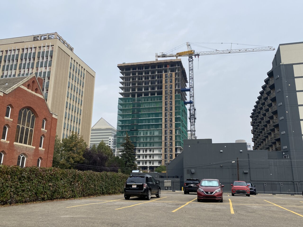
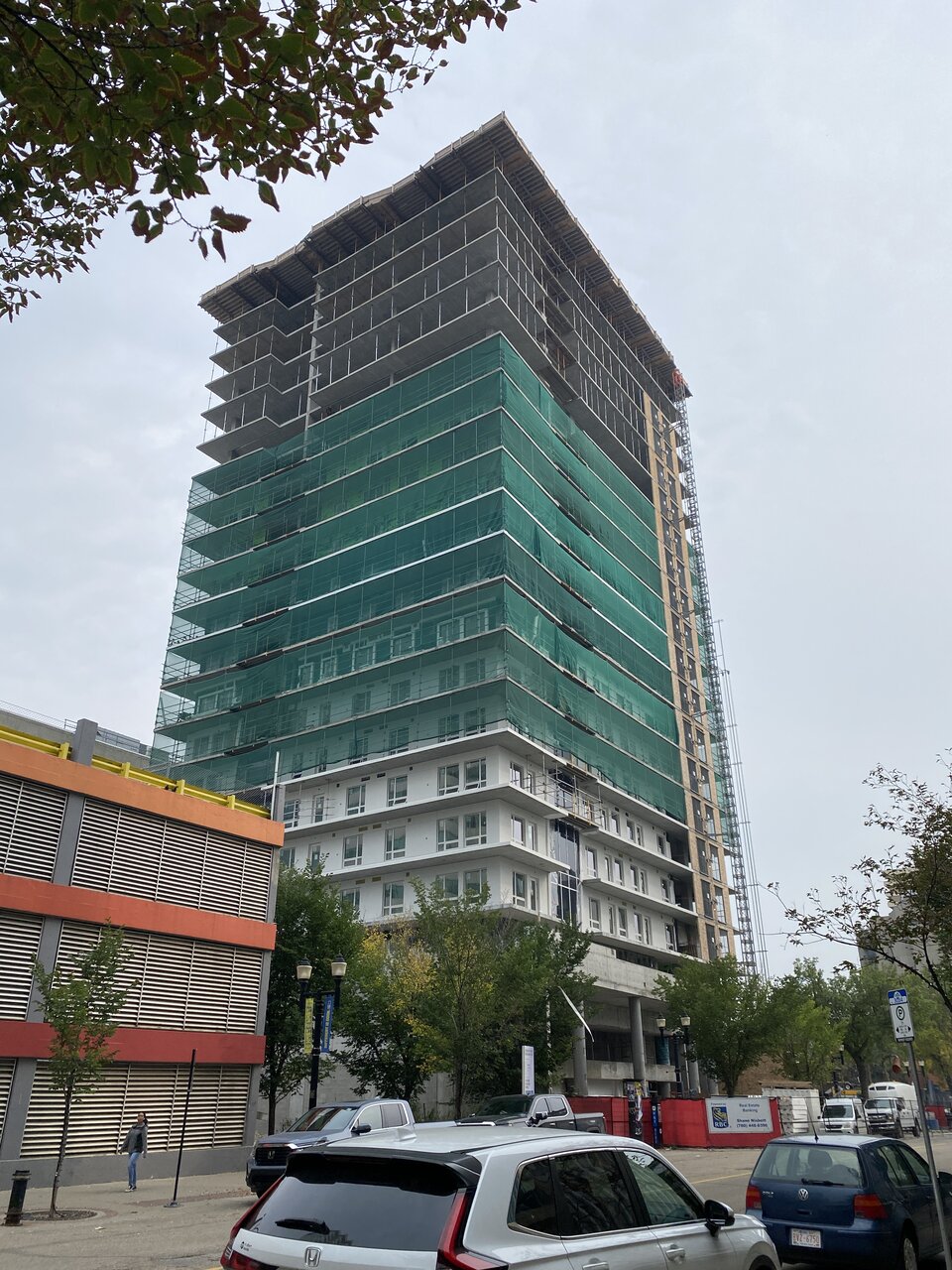
Another couple pics of the green monster


Last edited:
MacLac
Senior Member
I see the decorative "sliver" of glass is going in.....
Stevey_G
Active Member
I think that woulda been awesome myself.Do you speak for everyone? I think some people would have preferred something be there versus a bunch of empty CRUs five years post-completion. I recollect that it was proposed as a sports bar; not another Knoxvilles.
occidentalcapital
Senior Member
They still haven't figured out how to match the window tint between the curtain wall glass and the punched window glass?
air_ic
New Member
They went from 1 sliver of glass on icon, to 2 on the fox and now 4 on the falcon. They're gonna have to build a circular building next time.
IanO
Superstar
They went from 1 sliver of glass on icon, to 2 on the fox and now 4 on the falcon. They're gonna have to build a circular building next time.
Man I wish that I had the original Icon renderings... it was a Wall Centre.
Clearshades
Senior Member
Thank God for answering my prayers by convincing these guys to lower both towers. This is a welcomed filler, but I can assure it won't be close to a marvel. Not even close and just as I expected all along. The windows are much improved though. They have finally started to understand cosmopolitan and not little house on the prairie
Greenspace
Senior Member
Whattagame
Active Member
I think the glass balconies will have a substantial esthetic effect. Combined with the decent window coverage, the white stucco should be far less offensive than some are imagining.
dunno
Active Member
I think the glass balconies will have a substantial esthetic effect. Combined with the decent window coverage, the white stucco should be far less offensive than some are imagining.
Time will tell, but Langham’s track record suggests otherwise.
archited
Senior Member
Portland cement -- that which gives the stucco used on this project its stark white appearance -- is much more expensive than standard cement and so there was no expense spared here. I think it was a good aesthetic choice here in contrast to the glass spandrel ribbon that is set off against the Portland white stucco. Also the slight concave curvature of the balcony floor adds interest. In all, I think that this is a fine project from an architectural standpoint and I am looking forward to viewing the final results.
Clearshades
Senior Member
White is also a very dull color with any form of concrete/stucco.and dark colors don't do well for they absorb away the light. A compromise is to have color accessories to contrast that and pop it up a little. The tracks ( resembles mullions ) they use for the panels could be colors outside of black or white. They don't serve any structural integrity but pure cosmetics to tie and connect panels for fluidity. It is the DANG core, so I demand a little bit more for aesthetics.
BFitzStructEng
New Member
Portland cement is the most common type of cement...it is not a specialty product. It's also gray, not white. Maybe you're thinking of some other ingredient?Portland cement -- that which gives the stucco used on this project its stark white appearance -- is much more expensive than standard cement and so there was no expense spared here. I think it was a good aesthetic choice here in contrast to the glass spandrel ribbon that is set off against the Portland white stucco. Also the slight concave curvature of the balcony floor adds interest. In all, I think that this is a fine project from an architectural standpoint and I am looking forward to viewing the final results.