


Edmcowboy11
Senior Member
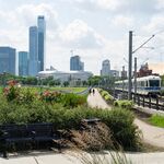
wow, that would really fix up the area.
|
|
|
Yes freakin' please!Kingsway Mixed-Use DP proposal going to EDC on Sept 16, 2025 for 9910 108A Avenue (Old Humpty's).
Potential for 68 residential units and 6 CRU's.
View attachment 679771
Kingsway Mixed-Use DP proposal going to EDC on Sept 16, 2025 for 9910 108A Avenue (Old Humpty's).
Potential for 68 residential units and 6 CRU's.
View attachment 679771
I don't think it includes the parking lot.Wow this would be huge! Does anyone know how much of that parking would be taken by this building? The whole lot is empty right from 108A Ave to 109A Ave now and it's such an eyesore.
That's ok as it gets rid of a blight that is that corner. Overrun by weeds and just looking sad.
I like it quite a bit. Keeps some of the original character and still adds modern contemporary elements. Reminds me of the Royal Ontario Museum in some ways.The addition is ok but not the greatest imho. The addition serves the function of providing light for the stairwell but it doesn't look much more than a geometric appendage to the building. The window framing of the addition would have given the building better continuity if it had been color coordinated with the building's existing windows. Leaving out a pediment was probably the right call but the door slab should have been updated at least to match the addition. Contrasts can look good but in this case a new door just looks left out and brings down the building's update.
Point taken on some of the details, but I don't find it at all a bad thing for it to look geometric. The ROM also came to mind for me; obviously it's not as dramatic (they weren't going to hire Daniel Libeskind for this one) but I think the contrast is the point.The addition is ok but not the greatest imho. The addition serves the function of providing light for the stairwell but it doesn't look much more than a geometric appendage to the building. The window framing of the addition would have given the building better continuity if it had been color coordinated with the building's existing windows. Leaving out a pediment was probably the right call but the door slab should have been updated at least to match the addition. Contrasts can look good but in this case a new door just looks left out and brings down the building's update.
I like it quite a bit. Keeps some of the original character and still adds modern contemporary elements. Reminds me of the Royal Ontario Museum in some ways.
If the option is between tearing it down or going with Star Wars architecture, then Star Wars is the better option. Unfortunate that it was hit by a meteorite though.Point taken on some of the details, but I don't find it at all a bad thing for it to look geometric. The ROM also came to mind for me; obviously it's not as dramatic (they weren't going to hire Daniel Libeskind for this one) but I think the contrast is the point.
The more important principle for me is that, even though it's no longer functioning as a religious building, people have taken the effort to maintain it, update it to modern needs (e.g. accessibility), and repurpose it. That's nothing new, but it feels all too rare in Edmonton. Contrast the rectory next to the cathedral that just got torn down...
Given the small size of the addition I feel it makes sense for it to match the building shape. I like the geometric here. We don't have a lot of older buildings, so I feel updating them is not a big skill set here, but it is doable.Point taken on some of the details, but I don't find it at all a bad thing for it to look geometric. The ROM also came to mind for me; obviously it's not as dramatic (they weren't going to hire Daniel Libeskind for this one) but I think the contrast is the point.
The more important principle for me is that, even though it's no longer functioning as a religious building, people have taken the effort to maintain it, update it to modern needs (e.g. accessibility), and repurpose it. That's nothing new, but it feels all too rare in Edmonton. Contrast the rectory next to the cathedral that just got torn down...