News   Apr 03, 2020
 8.2K     3 
News   Apr 02, 2020
 9.4K     0 
News   Apr 02, 2020
 3.1K     0 

Kingsway Mall

Daveography

Administrator
Staff member
Member Bio
Joined
Sep 22, 2015
Messages
10,218
Reaction score
23,070
Location
Edmonton, Alberta, Canada
Description: To construct interior alterations within a commercial mixed use building, associated with Suites 771, 772, 773 and 800, ''Kingsway Mall''. Demolition of existing second floor corridor and CRU demising walls to re-demise existing space for FUTURE Dollarama Tenant Fit Up in addition to additional CRU spaces. Re-routing of existing mechanical, electrical and plumbing services for new CRU demise. Raising doors on loading bay path to new space to 10' height. Increase in height of loading bay doors to allow for larger pallets to be moved through space.
Permit date: September 1, 2020
Type: Building Permit
Subtype: (03) Interior Alterations
Category: Commercial Final
Class: Malls, Office/Retail (512)
Status: Issued
Address: 1 - KINGSWAY GARDEN MALL NW
Neighbourhood: SPRUCE AVENUE
Zoning: CSC, CB2
Value: $250,000.00
 
Ledcor has been working there on the TI for that Sears spot for a few months now, was wondering what exactly they were doing there. Also--the Westmount location is closing? Wow,
 
Ledcor has been working there on the TI for that Sears spot for a few months now, was wondering what exactly they were doing there. Also--the Westmount location is closing? Wow,
They're too close apart and that Westmount store, although only 13 years old, is decrepit, poorly stocked and I rarely see a lot of traffic (Safeway, in the same mall, is more expensive and yet busier.)
 
They're too close apart and that Westmount store, although only 13 years old, is decrepit, poorly stocked and I rarely see a lot of traffic (Safeway, in the same mall, is more expensive and yet busier.)
I actually went and checked out that Walmart for the first time last Friday. I have never been in a Walmart before like that. Surprised this location made it through corporate approval. Super awkward layout with the two floors, crap selection for groceries, and overall feels super cramped inside. The lighting was also oddly dim. And it had a bit of a funk to it, smell-wise.

No surprise it's being closed.
It was the first Walmart I've ever been in Canada and it was quite a shock. I've seen 2 stories' Walmarts before, but they're usually big, spacious ones, not cramped, badly lit and with a bad merchandise selection.

I'm glad to see it go, and considering the lack of other retail and groceries around that area, it's not bad that they're moving to Kingsway. It also has the potential to drive up foot traffic in the mall. I would've preferred to see a smaller grocer and maybe new store spaces in that old Sears space, but it's better than a dead mall.
 
1st floor

20210926_124419.jpg


2nd floor

20210926_130552.jpg
 
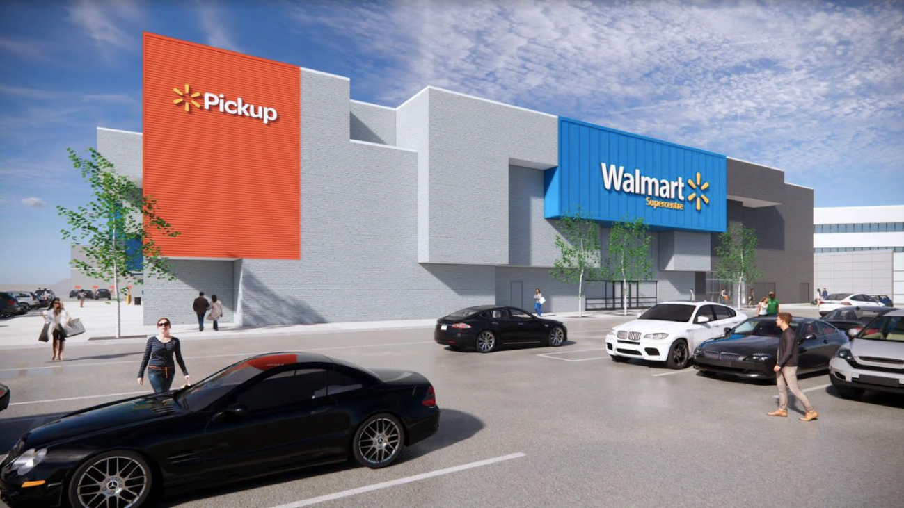
While I'm glad to see a major retailer taking up the voluminous Sears space in the mall, please, please, PLEASE can we fix the ghastly exterior? The Sears box, with chunks cut out of it, an asymmetrical appearance and part of the facade hanging out way too far, looks like a bad acid trip. Absolutely hideous.
It's a sad day when a Walmart might constitute an architectural IMPROVEMENT in a neighbourhood, but this is it.
1650795098191.png
 
I agree, nothing wrong with it - it is an example of architecture from the period. Not an example of cheap architecture to be criticized.
Its great the way it is - and Walmart will not be using leasehold improvement money for windows - people are there to shop and Walmart want maximum retail space.
 
I agree, nothing wrong with it - it is an example of architecture from the period. Not an example of cheap architecture to be criticized.
There's no architectural unity with the rest of the mall. No visual symmetry on the Sears box itself. It's about as attractive as Gene Dub's original cone design for City Hall.
 

Back
Top