|
|
|


You are using an out of date browser. It may not display this or other websites correctly.
You should upgrade or use an alternative browser.
You should upgrade or use an alternative browser.
Edmonton Real Estate Market
- Thread starter Daveography
- Start date
Stevey_G
Active Member
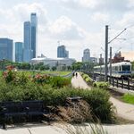
Any word on the downtown park? I’ve gotten vague and ambiguous responses about it from the city. It would definitely help motivate a residential conversion of the building.
ChazYEG
Senior Member
Word on the streets is that they'll be making come announcements soon. I can't give up my sources, but they're hot.Any word on the downtown park? I’ve gotten vague and ambiguous responses about it from the city. It would definitely help motivate a residential conversion of the building.
Guy 1
Active Member
If I recall correctly, the RFP for consultants was out a few months back?
ChazYEG
Senior Member
You are correct.If I recall correctly, the RFP for consultants was out a few months back?
northlands
Senior Member
RFP only closed like 10 days ago tho.
archited
Senior Member
Actually it wasn't an "RFP" (Request for Proposals); it was only an "RFI" (Request for Information)... the RFP is the next stage where 5 chosen competitors from the RFI round will design the park in their own vision -- they will have 15 months to do so -- and a winner will be chosen as the final consulting team.
Last edited:
kcantor
Senior Member
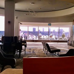
it was built on spec but it was reasonably well built for its time.What's energy square like on the inside? I love the gold windows but I have to imagine it makes for a very tinted environment.
it’s a bit tight floor to floor - thanks to the city centre airport - and the t-bar ceilings were a couple inches short of 8 feet but it’s a centre core building with a small floorplate so core to window distance is short and pretty much compensates.
the gold tint is actually real gold, same as it was on scotia place before they reclad. living with it is really easy as the tint is very effective but it doesn’t drastically change the quality of the light the way most tints do.
silver and grey and blue all start to change the hue with the greater the tint the greater the change but the eye doesn’t register it as much as other colours like red, yellow.
green in particular can change the light so much that the interior spaces can be uncomfortable because nothing looks the way it should (think about living full time wearing highly tinted sun glasses).
that’s partly why there is such consistency in tower colours albeit with commercial buildings typically selecting more tint for better energy performance and residential buildings keeping to the other end of the scale to stay more liveable. the uniformity people complain about in vancouver result is one of the results but so is the tendency nowadays for towers to use more than glass in their exterior and to use more articulation as a differentiator.
Stevey_G
Active Member
Thanks for sharing Ken.it was built on spec but it was reasonably well built for its time.
it’s a bit tight floor to floor - thanks to the city centre airport - and the t-bar ceilings were a couple inches short of 8 feet but it’s a centre core building with a small floorplate so core to window distance is short and pretty much compensates.
the gold tint is actually real gold, same as it was on scotia place before they reclad. living with it is really easy as the tint is very effective but it doesn’t drastically change the quality of the light the way most tints do.
silver and grey and blue all start to change the hue with the greater the tint the greater the change but the eye doesn’t register it as much as other colours like red, yellow.
green in particular can change the light so much that the interior spaces can be uncomfortable because nothing looks the way it should (think about living full time wearing highly tinted sun glasses).
that’s partly why there is such consistency in tower colours albeit with commercial buildings typically selecting more tint for better energy performance and residential buildings keeping to the other end of the scale to stay more liveable. the uniformity people complain about in vancouver result is one of the results but so is the tendency nowadays for towers to use more than glass in their exterior and to use more articulation as a differentiator.
I hope now that we are entering the age of metamaterials that they will be able to create different colors of tint that don't actually filter the light at all. It would make for diverse skylines for sure.
northlands
Senior Member
Makes it feel like you're working in the Matrix or what?green in particular can change the light so much that the interior spaces can be uncomfortable because nothing looks the way it should (think about living full time wearing highly tinted sun glasses).
KyleBlanchett
Active Member
Explore Edmonton has now taken over the intellectual property from Northlands. Northlands is getting smaller and smaller over years of mismanagement.
KyleBlanchett
Active Member
Explore Edmonton has now taken over the intellectual property from Northlands. Northlands is getting smaller and smaller over years of mismanagement.
roe_
Active Member
I hope Northlands doesn't wind up completely. There is little here that has existed for 140 years and it is sad to let an organization with that much history go so easily.
IanO
Superstar
David A
Senior Member
I don't mind the gold, it adds a bit of variety to the area. When the sun reflects off the windows it is spectacular, if you are nearby, but you might need sunglasses.it was built on spec but it was reasonably well built for its time.
it’s a bit tight floor to floor - thanks to the city centre airport - and the t-bar ceilings were a couple inches short of 8 feet but it’s a centre core building with a small floorplate so core to window distance is short and pretty much compensates.
the gold tint is actually real gold, same as it was on scotia place before they reclad. living with it is really easy as the tint is very effective but it doesn’t drastically change the quality of the light the way most tints do.
silver and grey and blue all start to change the hue with the greater the tint the greater the change but the eye doesn’t register it as much as other colours like red, yellow.
green in particular can change the light so much that the interior spaces can be uncomfortable because nothing looks the way it should (think about living full time wearing highly tinted sun glasses).
that’s partly why there is such consistency in tower colours albeit with commercial buildings typically selecting more tint for better energy performance and residential buildings keeping to the other end of the scale to stay more liveable. the uniformity people complain about in vancouver result is one of the results but so is the tendency nowadays for towers to use more than glass in their exterior and to use more articulation as a differentiator.
I looked at office space there a few years ago and I did notice the floor height was not as much as elsewhere. The building seemed well maintained, but perhaps due for some interior updates. The light inside seemed fine.