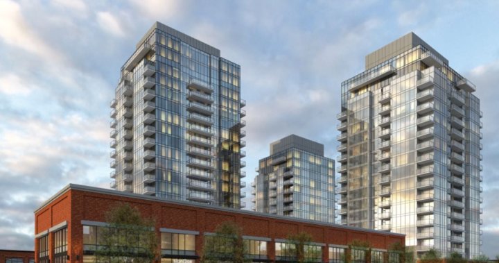
@positive1, as an architect, I could get drawn into a discussion -- rather lengthy I am guessing -- to do a thorough critique of the building. As a positive, the finishes are fine and the large window openings are also a plus. As I mentioned before, my strongest criticisms lie in missed opportunities from a planning perspective.
#1 the wind tunnel creation between the two towers at ground level. Towers (all towers when there is more than one) tend to create a kind of Venturi effect, speeding up prevailing winds by as much as a factor of 3. In Edmonton the prevailing winds are either from the westsouthwest (low pressure cell -- warming Chinooks in winter; thunderstorms in summer) or from the eastnortheast (high pressure cell -- brrrrrr in winter; hot and dry in summer). In any case the
average windspeed in Edmonton through the day (with some seasonal variations) is 8 mph (a little less than 13 kph). Increasing this average by a factor of 3 around towers would mean an
average of 24 mph (or about 38 kph). The space between the two towers in this proposal line up rather nicely for the prevailing winds to create a more-than-uncomfortable blast through the open space. This could be partially mitigated by landscape (generous use of evergreens to block the wind). Instead, however, the architects could have designed the podia of the towers to better enclose this space and to make it more functionally use-able. Considering the density of residential in the neighbourhood it could have been an ideal retail/hospitality enclave. To my mind NO thought was given to the utility of this space.
#2 Retail of the bricks-and-mortar variety is dying a very quick death and so designing a building with great massive retail bays -- particularly on a multi-storey facing wall -- is also poorly thought out. There are many scholarly articles on the demise of street-front retail. The "new" retail needs to be small, specialized, and reasonably agile (able to change locations and goods-variety quickly). The effort with this proposal again gives NO thought to the future -- just the "same old, same old". There could have been an imaginative cut through the Jasper Avenue frontage tying in the rear lane with myriad small niches for the "new" retail.
#3 the towers -- perhaps other than materials -- reflect a design idiom that is dated -- rectilinear towers with "bolted on balconies" -- hence the phrase "good enough for Edmonton".
Now, you may have specific reasons for liking this development. But if I take away the arguments for height, density and material usage, what is the defense?
The criminality here lies in the fact that this is potentially a two-block site that could have had pedestrian bridges spanning spaces for both ground-level pedestrians and vehicular traffic. It could have had a greater corner impact with an angled facade. It could have had more use-able common space both at ground level and on podia roofs. It could have been a "town centre" for Oliver. In essence we are talking about a similar situation to the Ice District's tower B -- remember how well thought out the original proposal was with pedestrian-traffic-generating grocery stores, fitness and sports stores, restaurants and movie theatres. How well received was the last version of tower B when even the podium rooftop garden pocket-park was stripped and the tower (diminished in size) became just another bolted-on balcony rectilinear structure?
