You are using an out of date browser. It may not display this or other websites correctly.
You should upgrade or use an alternative browser.
You should upgrade or use an alternative browser.
The Mercury Block | 21.7m | 6s
- Thread starter IanO
- Start date
mBertan
New Member
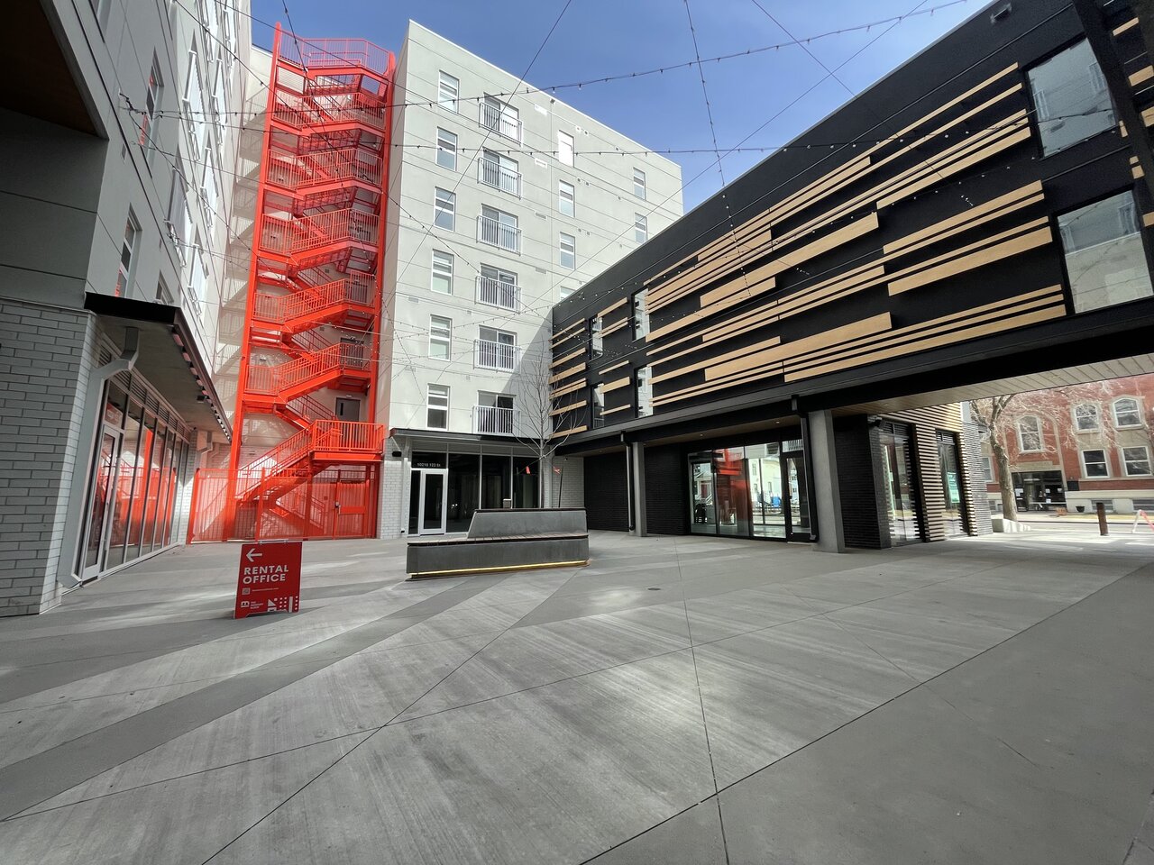
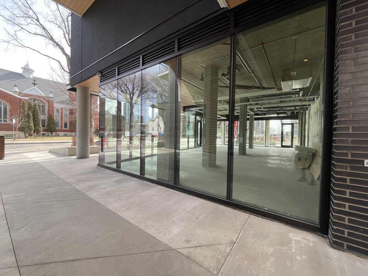
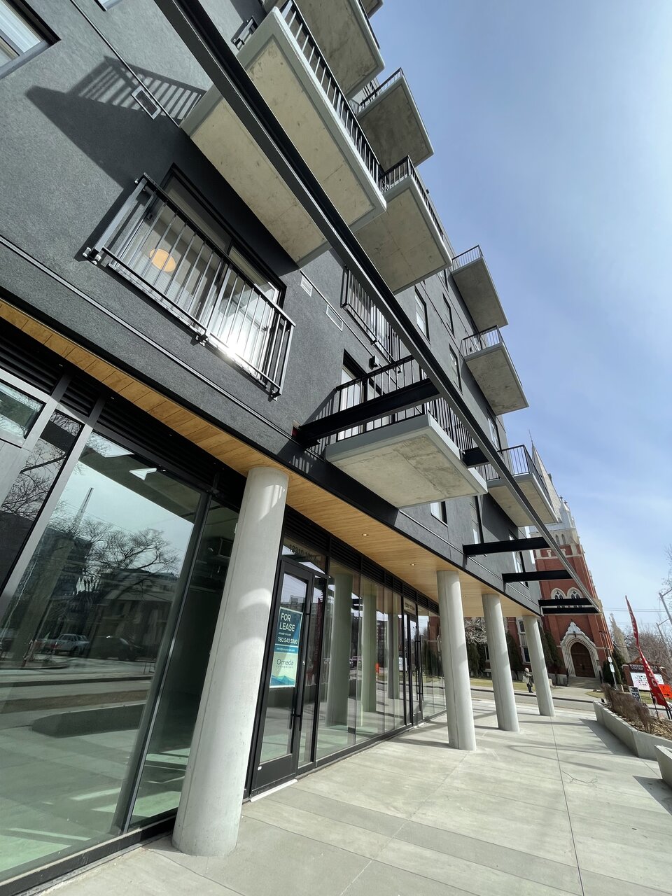
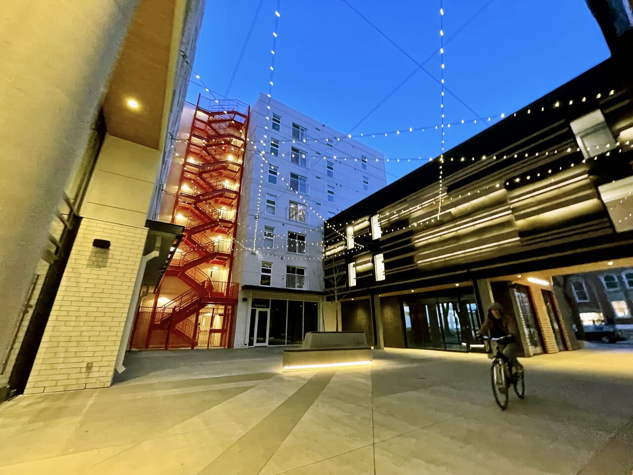
That Mercury Block (Oliver) has really turned out well. Open courtyard, ½ dozen retail units, all-windows podium...
buildings
Active Member
^is that a camera lens thing or are those columns tilty? edit: never mind, the church is drunk.
Last edited:
mBertan
New Member
It'll look all tilted from a fish' perspective^is that a camera lens thing or are those columns tilty?
mBertan
New Member
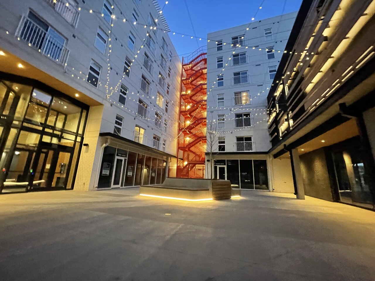
Lit up
TAS
Senior Member
Mini version of Ice District plaza when it first opened - great setting but not much life (yet) and a lot of empty CRUs. Look forward to it coming to life.
KreationYEG
Active Member
MacLac
Senior Member
Can someone please peel off that pink protective film on those balcony glass panes? It looks like crap all haphazard like it is....
Barnaby
Senior Member
Pretty sure that's architecturalCan someone please peel off that pink protective film on those balcony glass panes? It looks like crap all haphazard like it is....
itom987
Active Member
That building looks sexy, the mercury thermometer is about to explode! lol jk
thommyjo
Senior Member
Can’t tell if this is a joke haha.Can someone please peel off that pink protective film on those balcony glass panes? It looks like crap all haphazard like it is....
MacLac
Senior Member
Totally serious....not sure what else it would be. A set of pink curtains? If that pink screen is supposed to be there someone did a piss poor job. Just assumed it is protective filament aimed to be removed by the first lease holders within those particular units......Can’t tell if this is a joke haha.
dunno
Active Member
I think that the courtyard area is very beautifully designed but I'm not gonna lie the outside walls facing the street do look quite boring. I get this is Edmonton, where buildings like the Falcon Towers and Manchester Square have fans, but it's not exactly amazing architecture from the sides that most people will see. It's really just fine, courtyard aside. Still good density and looking forward to the influx of residents and visitors as the CRUs and residences fill up.
thommyjo
Senior Member
All g. Yeah, it’s part of the actual design. It’s the red accent theme that the stairs, signage, etc have. They chose to do it on the balcony glass too. It’ll be permanent.Totally serious....not sure what else it would be. A set of pink curtains? If that pink screen is supposed to be there someone did a piss poor job. Just assumed it is protective filament aimed to be removed by the first lease holders within those particular units......
dunno
Active Member
Is it meant to fully cover the balcony glass? If so, then it could make a nice accent punch. But if it's like how it is, with some panes untouched, other only half covered, that'd be weird.All g. Yeah, it’s part of the actual design. It’s the red accent theme that the stairs, signage, etc have. They chose to do it on the balcony glass too. It’ll be permanent.