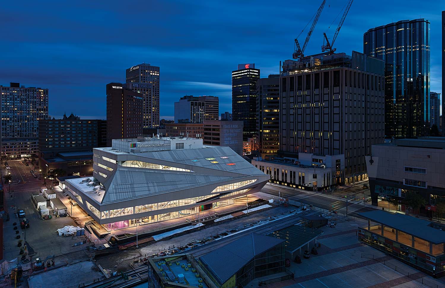
Stanley A. Milner Library | ?m | 6s | EPL | Teeple Architects

What do you think of this project?


  • Total voters
    62
Having heard the city use the term "world class" a few times, I think their definition of world class might be different than everyone else's.
i think they forget that for every class there's a "top of the class" and a "bottom of the class". simply saying you're "in the class" is not of itself noteworthy or even desirable.
 
View attachment 293722
They took this photo at dusk and literally photoshopped the image to make the library appear brighter (warmer) than everything else around it. What a massive red flag.
 
They took this photo at dusk and literally photoshopped the image to make the library appear brighter (warmer) than everything else around it. What a massive red flag.
I like how they described the exterior as a 'high performance envelope'. Maybe for energy efficiency, but for sure nothing else (especially appearance!).
 
Calgary's new library is pretty spectacular sure, but they chose to build a completely new building from the ground up whereas we renovated an older building, a more complicated and constrictive but interesting and conservationist move on our part. I agree, it could've been done better in more than a few ways and we can sit here all day and pick away at what went wrong here, but I still like this library and enjoy coming here (when I can haha). I'd never been to this library before the reno so I don't really have any connection to the old building, and maybe that's also why I don't feel as disappointed as some of you guys do. No matter what, me and my friends still enjoyed and will enjoy coming here after school to hang out and do work (and going to get a bite at Tres Carnales Taqueria afterwards was always a treat ;)). It's another way for me to be in the core of the city I call home, and I appreciate it for that. I just hope that as our city improves we can start to see some of these "world-class" projects appearing here and there ya'know?😅
 
I really see this as a wasted opportunity to create a destination building, the building just falls short. I don't see a a way there will be some connectivity to the plaza the way other cities have around their central libraries. Inside is OK, kind of brings it up to date with similar public spaces in other parts of the world but is not innovative or unique.

I like Tres Carnales, btw.
 
I just watched a video on institutional architecture and design and, specifically, libraries, and it made me want to cry just from comparing those true "world class" projects to this glorified tin warehouse Teeple gave us.
Really, what in the freck was wrong with them when this design and, most importantly, the "envelope" material were approved? Like, doesn't Edmonton have a design committee? A City Counsil? A Mayor? Actual human beings?

Sorry about the venting, but it's just so sad to think about the lost opportunity here... Plus the LITERALLY immense eyesore of a building.
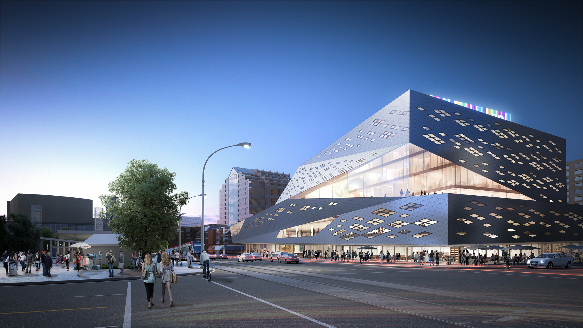
 
Keep in mind that 'we' valued engineered the exterior and forced the architect's hand.

I quite like the zinc, but do take issue with the total surface area and choice of 'colour'.

Our Design Committee, City Architect and powers that be approved this.
 
Last edited:
^
An interesting article... While the interiors may be successful, a building - particularly one in such a prominent location as this one - should have a successful exterior as well. I find it telling that the article (as well as the linked article in Teeples own magazine) only features a single severely photoshopped exterior image of the building taken from an angle almost no-one will experience in real life. It might be a great article but I'm not ready to accept it as great architecture. :(
 

Back
Top